
Letter by Letter: Trace the Story of Latin Calligraphy with Scriveiner
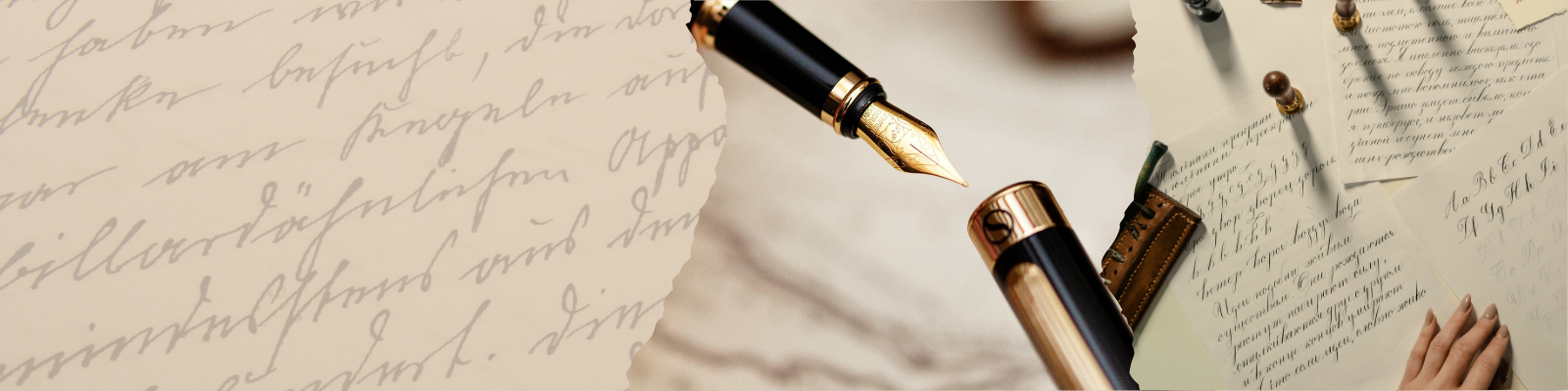
The best part of owning a beautiful Scriveiner pen is using it. There's something deeply satisfying about the feel of smooth ink on paper: luxury stationery inspires you to refine your everyday handwriting. Your lines become more precise, your thoughts more deliberate, and, somewhere in the process, you find yourself more connected to what you write.
As someone working on our handwriting, we couldn’t help but ask: why do Latin letters look the way they do? Why do certain shapes appear “elegant” or “refined”? What lies behind their evolution? The answers led us down a rabbit hole of calligraphy and revealed a story that is not only artistic but political, religious, and deeply social.
I. Roman Capitals (Capitalis Monumentalis)

Emerging in Ancient Rome, Roman Capitals were not the script of daily scribbles, but the high-status visual language of power and permanence. Carved into stone monuments and official inscriptions, these letterforms were the architectural blueprint of Western typography. Each letter was constructed within an imaginary square, harmoniously balanced and marked by clear, geometric serifs. The result is a script that feels regal, timeless, and exact.
Roman Capitals likely evolved as a “deluxe” version of the cursive scripts used for everyday documentation. They weren’t fast to write. But they weren’t meant to be! These letters were for permanence, clarity, and visual gravitas. Their influence remains profound: even today, typefaces like Trajan draw directly from these forms.
II. Uncial Script

By the 4th century AD, a need for faster, more fluid writing gave rise to the Uncial script. Rounded, broad, and relatively spacious, Uncial letters could be written more quickly with a pen held at a consistent angle. While the script retained the absence of spacing and punctuation typical of earlier writing systems, it marked a step toward a more reader-friendly visual rhythm.
Uncial is believed to have developed from rustic capitals, which themselves were used for more everyday writing in ancient Rome and Greece. Its rounded strokes lent themselves to parchment and vellum more than to carved stone, making it a favourite for manuscript production in both the Latin and Greek traditions.
Although it began as a practical adaptation, Uncial evolved into a stylistically rich script, especially in Christian contexts, where its smooth, flowing form helped convey sacred texts with elegance and dignity.
III. Insular Script

The insular script developed in the monastic culture of Ireland in the 7th century and spread across Anglo-Saxon England and parts of Europe through the missionary efforts of Irish monks. With its distinctive blend of curves, angularity, and ornamentation, Insular calligraphy is instantly recognisable.
The script is often adorned with large initial letters framed by red ink dots, stylised ascenders, and sometimes interlacing or zoomorphic decorations. These embellishments weren't merely decorative; they reflected the insular monks’ devotion to text as sacred art.
Despite the visual complexity, Insular scripts were highly functional. They often featured a clear distinction between different parts of text through decorated initials and layout innovations, hallmarks of the Insular tradition that would later influence Carolingian script reform.
IV. Carolingian Minuscule

In the 8th and 9th centuries, a renaissance of literacy began under Charlemagne’s reign. While the emperor himself could barely read, he understood the administrative power of a unified script. Thus, under the guidance of scholar Alcuin of York, the Carolingian minuscule was born.
This script was revolutionary. It introduced consistent lowercase forms, spacing between words, and a system of punctuation. The visual result was both orderly and readable. It was a script that could be taught, replicated, and spread across the empire.
Carolingian minuscule wasn’t just a writing system. It became a part of a broader cultural revival. Its clarity helped preserve ancient Roman and Christian texts, and centuries later, it would inspire the Humanists of the Italian Renaissance, who mistook it for classical Roman handwriting.
V. Gothic (Blackletter)

By the 12th century, Europe needed books, lots of them. The swelling university system, bureaucracy, and religious institutions demanded texts faster than scribes using the wide, flowing Carolingian minuscule could supply. Enter Blackletter.
Condensed and angular, Blackletter could be written faster and fit more text onto expensive parchment. It featured broken strokes, dense spacing, and elaborate verticals, which some called “textura.” Though harder to read at a glance, it was efficient and visually powerful.
Different regional variations (Textura, Rotunda, Bastarda, and Fraktur) flourished, especially in northern Europe. The script became associated with both religious solemnity and scholarly seriousness, dominating European books until the early printing press era.
VI. Humanist Minuscule

By the 15th century, Renaissance humanists in Italy sought to “recover” the classical past, and with it, a script they believed to be Roman. In reality, what they rediscovered was Carolingian minuscule. But they refined it: lighter, more spacious, and elegant, Humanist Minuscule became the hallmark of intellectual writing. Its name originates from the content of the texts — law, medicine, and philosophy.
This script stood in stark contrast to the dense Gothic. It was round, balanced, and designed to echo the clarity and proportion of Roman ideals. Its clean simplicity was ideal for copying texts on law, philosophy, and classical literature.
Humanist Minuscule would later inspire the first Roman typefaces, still the basis of most modern Latin typography today.
VII. Chancery Cursive

As the Renaissance brought renewed interest in classical form and clear communication, a need arose for a script that could match the pace of daily writing without sacrificing elegance. Chancery Cursive (or cancelleresca), developed in the papal chancery in the 15th century, answered that call.
Evolving from Humanist Minuscule, this hand introduced a more fluid structure, allowing scribes to hold the pen at a 45-degree angle: an innovation that enabled faster, smoother strokes. The result was a script that retained the dignity of Humanist forms but moved with the ease of a working hand. With its gentle slant, open loops, and graceful ligatures, Chancery Cursive quickly spread across Europe and became a model for formal cursive writing. Its influence still lingers today in the shapes and flow of modern penmanship. A reminder that even beauty, when well-designed, can keep up with real life.
Editor's Choice: Court Hand

Speaking of keeping up with real life. Used in English legal documents from the medieval period through to the 18th century, Court Hand was a cursive script developed for record-keeping in royal and ecclesiastical courts. Over time, however, practicality gave way to flourish.
By the 17th century, the script had become so elaborate, twisted, looped, and compressed that it was nearly impossible to read unless one had been trained specifically in its quirks. It looked more like a tangled thread than handwriting.
Despite its prestigious role in legal affairs, Court Hand eventually fell victim to its own excesses. In 1731, it was officially abolished for court use in England, not because it was old-fashioned, but because it had become too difficult to decipher. A writing style designed for clarity and authority had, ironically, rendered the law unreadable.
It’s fascinating to see how handwriting evolved, not in isolation, but shaped by the forces of power, faith, knowledge, and necessity. Each script carries the marks of its time, revealing how the simple act of writing could reflect an empire’s ambition or a monk’s devotion. We’re only at the beginning of this journey, and we’re thrilled to explore the art of calligraphy even further. Letter by letter, line by line — learn more every day with Scriveiner.
MORE TO EXPLORE:


Leave a comment
This site is protected by hCaptcha and the hCaptcha Privacy Policy and Terms of Service apply.