

Your Guide to Calligraphy Fountain Pens
If you have ever admired the sweeping curves and elegant lines of beautiful handwriting, you have likely encountered the art of calligraphy. A calligraphy fountain pen is distinct from the standard pen one might use for daily notes; those are designed for uniform, everyday script.
This is something different. A calligraphy pen is a specialised instrument, engineered with a nib that can produce wonderfully varied strokes. It elevates the simple act of writing into a personal art form. For anyone looking to truly refine their penmanship, this is the essential first step.
The Resurgence of an Elegant Tradition
In a world defined by digital immediacy, many are rediscovering the grounding satisfaction of putting pen to paper. The art of calligraphy is enjoying a remarkable revival, and its appeal is clear. It offers a mindful escape, a way to connect with words on a deeper level, and an opportunity to create something genuinely beautiful with one's own hands.
This is not simply nostalgia. It is a quiet rebellion against the impersonal, reflecting a growing appreciation for craftsmanship and authentic personal expression.
Market data tells a similar story. The fine writing instrument market is thriving, with the UK sector alone generating an impressive USD 554.6 million in 2023. Projections show it climbing to USD 818.9 million by 2030. Within this market, fountain pens hold a special place, capturing the hearts of enthusiasts who value their unique writing experience. For a closer look at these trends, you can explore the full report on the fountain pen market by Verified Market Research.
More Than Just a Writing Tool
Consider a calligraphy fountain pen not as a functional object, but as an instrument of artistry. A standard pen is built for speed and consistency. A calligraphy pen, by contrast, is engineered to translate the subtle movements of your hand into graceful, flowing script.
It invites a slower, more intentional approach. Everyday tasks like journaling or writing a letter are transformed into moments of creative pleasure. It is about the sensation of the nib gliding across the page, watching the ink flow, and seeing your thoughts take on a tangible, elegant form.
This journey into beautiful writing connects us to a rich heritage of penmanship that has evolved over centuries. To understand this lineage better, you can delve into the fascinating history of Latin calligraphy with Scriveiner and see how historical scripts have shaped the art we practise today.
A well-crafted calligraphy pen does more than just write; it empowers you to express your unique voice through the timeless beauty of letterforms. It is a bridge between thought and art, held directly in your hand.
This guide is designed to be your companion as you begin. We will explore everything from the intricate anatomy of calligraphy nibs to selecting the perfect inks and papers, providing you with the knowledge to start your own practice with confidence and style.
Understanding the Anatomy of a Calligraphy Nib
If a calligraphy pen possesses a soul, it resides in the nib. This small, masterfully engineered piece of metal is what transforms your hand's movements into art. It defines the character of every letter you form. Much like a sculptor's collection of chisels, each nib is shaped for a specific purpose and designed to create a distinct effect.
Calligraphy nibs are engineered for one primary purpose: creating deliberate and beautiful line variation. A standard fountain pen is designed for a consistent, uniform line. These specialist nibs, however, are made to respond to the artist’s hand, creating a dynamic dance of thick and thin strokes that brings a script to life. This responsive quality is what truly sets a calligraphic instrument apart.
The pen is the tool that connects the writer to a rich heritage while unlocking modern artistic expression. To truly appreciate this connection, we must examine the different kinds of nibs that make it possible.
The Expressive Flex Nib
The flex nib is perhaps the most dramatic of the specialist nibs. It is known for producing incredible line variation based purely on the pressure you apply as you write. The tines—the two halves of the nib that meet at the tip—are designed to spread apart when you apply gentle pressure on a downstroke.
This spreading action allows more ink to flow onto the page, creating a broad, expressive line. When you lift the pressure on an upstroke, the tines spring back together, producing a delicate, hairline-thin stroke.
The result is the beautiful, swelling script seen in classic Copperplate and Spencerian styles. A flex nib sings on the page, its voice rising and falling with the rhythm of your hand.
Mastering a flex nib requires a light touch and a feel for nuance. You must consciously control the pressure to achieve the desired effect. It is a wonderfully responsive tool that rewards patience with breathtaking results.
The Architectural Italic Nib
While a flex nib creates variation through pressure, an italic nib achieves it with its shape. Sometimes called a crisp or sharp italic, this nib has a broad, flat tip with very sharp, defined corners.
This architectural design creates a stark contrast between thick and thin strokes based entirely on the direction of pen movement. Vertical strokes are broad; horizontal strokes are razor-thin. It is this built-in characteristic that gives scripts like Italic and Gothic their structured, formal appearance.
Writing with an italic nib requires maintaining a consistent angle to the page, usually around 45 degrees. The nib itself creates the variation, so your focus shifts from pressure to consistency and form. It is less forgiving than other nibs because of its sharp edges, but the crisp, clean lines it produces are unmatched.
The Forgiving Stub Nib
Consider the stub nib as the italic’s gentler, more forgiving cousin. Like the italic, it has a broad, flat tip, but its corners are rounded and smooth instead of sharp. This small design change makes a world of difference to the writing experience.
The rounded edges allow the stub nib to glide across the paper, making it far more comfortable for everyday writing while still delivering elegant line variation. The contrast between thick and thin strokes is softer and less pronounced than with an italic nib, adding a subtle flair to your handwriting without demanding the intense focus of a sharp italic.
This makes the stub nib a brilliant entry point for anyone new to broad-edged calligraphy. It allows you to experience the joy of line variation in your daily notes and letters, adding a touch of sophistication effortlessly.
To help you visualise how these nibs compare, here is a quick breakdown of their key features and uses.
Comparing Calligraphy Fountain Pen Nib Types
| Nib Type | Key Characteristic | Line Variation | Best Suited For |
|---|---|---|---|
| Flex Nib | Tines spread with pressure | High, pressure-sensitive | Copperplate, Spencerian, modern calligraphy |
| Italic Nib | Broad, flat tip with sharp corners | High, direction-based | Italic, Gothic, formal scripts |
| Stub Nib | Broad, flat tip with rounded corners | Moderate, direction-based | Everyday writing with flair, journaling |
Each of these nibs offers a unique path to artistic expression, inviting you to discover the style that best suits your own creative voice. If you are curious to learn more, our comprehensive guide to fountain pen nib types offers a deeper dive into the world of nibs.
How Calligraphy Pens Differ from Standard Fountain Pens
At first glance, a calligraphy pen and a standard fountain pen might appear similar. However, not all fountain pens are built for the expressive, flowing art of calligraphy. Your everyday fountain pen is a dependable workhorse, designed to lay down a consistent, uniform line with minimal fuss. Its purpose is clarity and efficiency.
A calligraphy fountain pen, on the other hand, is a specialist's instrument. It is engineered to create the beautifully varied strokes that make a script sing. The difference can be likened to that between a functional kitchen knife and a chef’s Santoku blade—both cut, but one is designed for artistry, precision, and expressive potential.
This crucial distinction is not accidental. It comes down to purpose-driven design, focusing on three key areas: the nib, the ink delivery system, and the overall balance of the pen in your hand.
The Heart of the Matter: The Nib
The most important difference, without a doubt, is the nib. A standard fountain pen almost always has a firm, rounded tip. It is made to glide smoothly across the page, producing the same even line regardless of direction or pressure. Consistency is its main virtue.
A calligraphy fountain pen, however, uses a specialised nib—like a flex, italic, or stub—that is engineered to produce line variation.
- Flex Nibs respond to pressure. As you press down, the tines spread apart, creating a much broader stroke.
- Italic and Stub Nibs have broad, flat tips. They create thick lines on downstrokes and thin lines on cross-strokes, all depending on the direction of movement.
This ability to vary the width of a line is the very soul of calligraphy, and it is the single greatest distinction between these pens. A standard pen is designed to resist variation; a calligraphy pen is built to create it.
To put it simply, a standard pen writes your words, but a calligraphy fountain pen helps you draw them. The instrument becomes an extension of your artistic intent, translating subtle hand movements into elegant letterforms.
Ink Flow and Overall Balance
Beyond the nib, the internal mechanics are also different. The feed, the component that regulates ink flow from the reservoir to the nib, is often engineered differently in calligraphy pens. A flex nib, for example, needs a feed that can deliver a sudden rush of ink when the tines spread wide, preventing the pen from running dry in the middle of a bold downstroke.
The overall balance and weight of the pen are also carefully considered. While many standard pens are designed to be light for long, comfortable writing sessions, a calligraphy pen might have a specific balance point that gives the writer more control for deliberate, precise strokes. This thoughtful design helps the artist maintain a consistent angle and pressure.
Ultimately, choosing between the two comes down to your objective. For jotting quick notes or writing a report, a standard pen is perfectly suitable. But if you wish to turn your handwriting into a form of personal expression, a purpose-built calligraphy fountain pen is an essential tool. If you are looking for an instrument that excels in daily use, our guide to the best pens for writing can help you find the perfect match for everyday tasks.
Selecting the Right Ink and Paper for Your Pen
A beautiful pen is only part of the equation. To see it truly perform, you must pair it with the right ink and paper. These are not mere accessories; they are partners in the act of writing, profoundly shaping the final look of your script and the sensation of the pen gliding across the page. Much like a master chef selecting the finest ingredients, the right combination is what creates the magic.

This synergy between pen, ink, and paper is especially appreciated in the UK, where a deep-rooted love for fine penmanship thrives. The nation’s passion is clear, commanding a 31.73% share of Europe's fountain pen market. This enthusiasm is fuelled by a rich history and a modern boom in calligraphy workshops, with over 5,000 events hosted annually by handwriting societies since 2020. It is no surprise, then, that artists and academics are driving a 28% year-on-year increase in online searches for fountain pens, all seeking the precision of a quality nib. You can read more about the trends shaping the fountain pen market to understand this growing community.
Choosing the Ideal Fountain Pen Ink
The world of fountain pen ink is wonderfully vibrant, a vast spectrum of colours and properties waiting to be explored. However, not all inks are created equal, and using the wrong type can damage both your writing and your pen. The single most important rule is this: the ink must be specifically formulated for fountain pens.
These specialised inks are typically water-based dyes, engineered with a precise viscosity and flow rate to work in harmony with a pen's delicate feed system. This careful balance ensures a smooth, consistent line without clogging the intricate channels that deliver ink to the nib.
A common and costly mistake is to use inks designed for dip pens, such as India ink or acrylic inks. These formulas contain shellac or pigments that will dry and harden inside your pen, causing permanent blockages and rendering it unusable. Always choose inks explicitly labelled as "fountain pen safe."
When selecting an ink, pay attention to its behaviour on the page. You are looking for:
- Good Flow: The ink should move smoothly from the nib without skipping or feeling dry.
- Vibrant Saturation: A well-pigmented ink will display its rich, true colour.
- Reasonable Drying Time: It should dry quickly enough to prevent smudging but not so fast that it dries on the nib itself.
Experimenting with different ink colours is one of the great joys of using a calligraphy fountain pen. A new shade can completely transform the character of your writing, opening up a world of creative expression.
The Importance of High-Quality Paper
Just as crucial as the ink is the paper you write on. Using a premium fountain pen on standard office paper is like serving a gourmet meal on a paper plate—the experience is diminished, and the results are often disappointing. Poor-quality paper can lead to a few undesirable effects that detract from the beauty of your calligraphy.
One common issue is feathering, where the ink spreads into the paper fibres, creating fuzzy, indistinct lines instead of crisp edges. Another is bleed-through, which happens when the ink soaks completely through the page, making the other side unusable. A related problem, ghosting, occurs when the writing is visible from the reverse, even if it has not bled through entirely.
To avoid these frustrations, seek out paper designed for fountain pens. Here is what to look for:
- Higher Grammage: Look for paper with a weight of 80 gsm (grams per square metre) or higher. This thickness helps prevent bleed-through.
- Smooth Finish: A smooth, often coated surface allows the nib to glide effortlessly and keeps the ink sitting on top of the paper, resulting in sharper lines.
- Acid-Free Composition: This ensures your written work will not yellow or degrade over time, preserving it for years to come.
By carefully selecting your ink and paper, you create the perfect stage for your calligraphy fountain pen to perform. This thoughtful pairing elevates the entire writing process, transforming it from a simple act into a refined and deeply satisfying art form.
Mastering Fundamental Calligraphy Techniques
True mastery in calligraphy is not about memorising drills. It is a delicate dance between pressure, angle, and rhythm, where the pen begins to feel like a natural extension of your hand. Think less about rigid instruction and more about developing an intuitive feel for the strokes.
Each mark you make is a conscious act, a direct connection between your movement and the line left on the paper. This section outlines the core principles that form the foundation of elegant penmanship, encouraging a gentle, patient approach to your practice.
The Art of Pressure and Flex
With a flex nib, the magic lies in the pressure. This is the skill of varying the force applied to the pen, which creates the beautiful contrast between thick and thin lines seen in scripts like Copperplate. Imagine controlling the volume on a musical instrument.
A downstroke receives gentle pressure, which allows the nib’s tines to spread and lay down a rich, broad line of ink. On an upstroke, your touch should be almost weightless. The tines close, producing a line as fine as a whisper. The real art is in the fluid, controlled transition between these thicks and thins, which gives the letters their life and character. This requires sensitivity, not brute force.
The goal is to develop a feel for the pen's responsiveness. A quality calligraphy fountain pen will communicate with you, providing tactile feedback that guides your hand in creating elegant, flowing forms.
Maintaining a Consistent Angle
When you use a broad-edged nib, like an italic or a stub, the focus shifts from pressure to angle. These nibs have a flat, wide tip that creates line variation based on the direction of your stroke, not the force you apply. To achieve those beautifully structured, chiselled letterforms, your main discipline is holding a consistent pen angle to the page—usually around 45 degrees.
Keeping this angle steady ensures all your vertical strokes are broad and uniform, while horizontal strokes stay crisp and thin. It is this consistency that gives scripts like Italic their distinctive architectural beauty. Your hand should guide the pen across the page while your wrist and fingers remain relatively stable, preserving that crucial angle.
- Practice with Purpose: Do not just mindlessly repeat drills. Pay attention to the sensation of the nib on the paper and notice how tiny changes in your hold affect the lines you create.
- Embrace the Rhythm: Calligraphy has a natural rhythm. Find a comfortable, steady pace that allows you to form letters with intention and grace, without rushing or hesitating.
- Observe and Adapt: Look closely at examples of scripts you admire. Notice the flow, the spacing, and the consistency. Use these observations to inform and refine your own practice over time.
For anyone wishing to see these principles in action, the video tutorial above offers an excellent, brand-neutral demonstration. It serves as a superb visual guide to the basic strokes and a clear starting point for your own journey with calligraphy fountain pens.
Choosing Your Ideal Scriveiner Calligraphy Pen
Choosing a pen is a personal affair, much like an artist selecting the right brush. The right one should feel like an extension of your own hand, a conduit that allows your thoughts to flow onto the page without resistance. We designed Scriveiner pens with this very sensation in mind, aiming to offer a refined writing experience for everyone, from the simply curious to the seasoned professional.
Your path into penmanship is yours alone. The right instrument will not just support your journey; it will inspire it. Whether you are just beginning with calligraphy or looking for a distinguished tool to match your expertise, the perfect pen awaits.
For the Emerging Calligrapher
When you are new to the art of beautiful writing, those first experiences are paramount. A pen that is difficult to handle can be discouraging, but an instrument that glides smoothly across the paper builds confidence. For beginners, a reliable and forgiving pen is the best place to start.
A Scriveiner pen with a well-balanced body and a smooth, consistent nib makes for an excellent first tool. It gives you the control needed to practise your foundational strokes without being encumbered by the complexities of more specialised nibs. This frees you to focus on your letterforms and rhythm, making the learning process a genuine pleasure.
For the Seasoned Enthusiast
An experienced calligrapher appreciates the subtle differences that elevate a good pen to a great one. For the artist and enthusiast, factors like perfect balance, the feel of the material in your hand, and aesthetic elegance become just as important as the nib. A pen is no longer just a tool; it is a trusted partner in the creative process.
Our collection offers pens crafted with a meticulous eye for detail, featuring superior materials and an equilibrium that feels poised and ready. These instruments are designed to perform flawlessly, allowing you to immerse yourself in your work, confident that your pen will respond to every delicate movement.
A truly fine writing instrument does more than simply write; it inspires. For the enthusiast, the right pen elevates the entire creative experience, making each session a moment of refined expression and personal satisfaction.
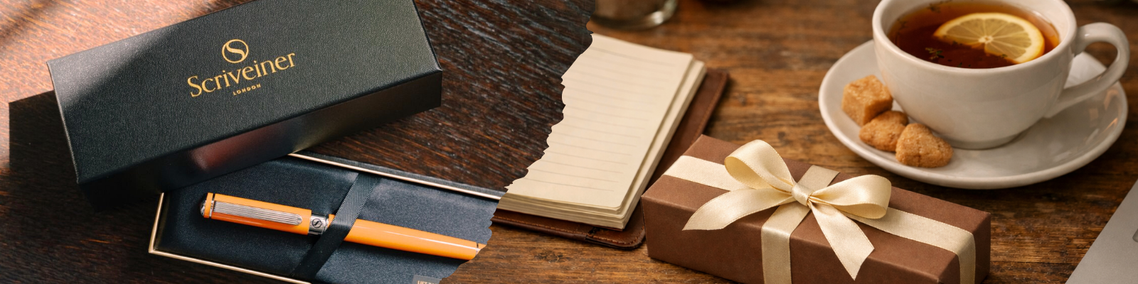
The Perfect Gift of Timeless Elegance
A beautifully crafted pen is a gift that speaks volumes. It conveys thought, respect, and a deep appreciation for quality. In the UK, the tradition of giving a fine writing instrument is particularly strong, with gift buyers and corporate clients making up over 60% of high-end purchases. It is a tradition that continues to thrive, kept vibrant by modern innovations in design and nib geometry. You can learn more about the UK's thriving luxury pen market at Grandview Research.
Every Scriveiner pen is presented in an elegant gift box, making the unboxing a memorable experience that signals the quality held within. It is a timeless gift for celebrating milestones like graduations, promotions, or retirements—an object to be treasured for a lifetime.
A Statement for Corporate Clients
In the corporate world, details matter. A premium writing instrument makes a powerful statement about a company’s commitment to quality and sophistication. As a corporate gift, a Scriveiner pen is both practical and prestigious, leaving a lasting, positive impression on clients, partners, and employees.
Choosing a Scriveiner pen shows an appreciation for classic design and exceptional craftsmanship. It is a sophisticated way to acknowledge an achievement or strengthen a professional relationship, communicating a message of enduring value. This makes it an ideal choice for organisations looking to distinguish themselves with purpose and style.
Maintaining Your Calligraphy Fountain Pen
A fine writing instrument is more than just a tool; it is a companion for life, an extension of your creative spirit. And like any precision instrument, it performs best when treated with care. Consider it akin to a musician tuning their instrument before a performance. Tending to your pen is a simple, almost meditative ritual that ensures it remains responsive, reliable, and ready for years of beautiful service.

The foundation of pen care is surprisingly simple: regular cleaning. Over time, the dyes, pigments, and binders in ink can accumulate inside the pen’s intricate feed system. This residue can obstruct flow and lead to skips and starts. A thorough flush every few weeks, or whenever you change ink colours, is all it takes to keep things running smoothly.
The Importance of Regular Flushing
Imagine the pen’s feed system—the part that channels ink to the nib—as a network of tiny arteries. Ink residue can slowly narrow these passages, restricting the vital flow to the nib. A regular flush with cool, clean water is like clearing those pathways, restoring your pen to its optimal condition.
This is especially crucial when you are switching between inks. Even small traces of an old colour can react with a new one, sometimes creating stubborn sediment that is difficult to remove. A clean transition between colours ensures that each new ink appears on the page exactly as it should, pure and unadulterated.
A well-maintained pen is a predictable partner in your creative expression. Consistent care prevents common frustrations, allowing you to focus purely on the art of lettering without interruption from your instrument.
Addressing Common Performance Issues
Even the most carefully maintained pen can have an occasional issue. The good news is that most performance hiccups are minor and easily remedied with a bit of know-how. Understanding how to diagnose and address them will keep your pen writing smoothly.
Common Troubleshooting:
- Skipping or Hard Starts: This is the most common issue, usually pointing to a blockage in the feed or dried ink on the nib. The first and most effective solution is a thorough flush. This almost always clears the obstruction.
- Inconsistent Ink Flow: If your lines are going from faint to dark and back again, the feed might be struggling to keep pace. This can happen with thicker inks or a partial clog. Again, flushing is the primary remedy.
- Feathering or Bleeding: While often a paper issue, a pen that suddenly starts to feather might have an oversaturated feed. Try gently blotting the nib on a paper towel to draw out the excess ink before you begin writing.
These simple routines do more than just keep your pen working. They deepen your connection to it. By understanding how your pen works and how to care for it, you transform it from a mere object into a cherished instrument. This mindful practice reinforces its value, ensuring it remains a reliable and inspiring partner in every creative endeavour.
At Scriveiner, we believe a beautiful pen should be a lifelong companion. Explore our collection of exquisitely crafted writing instruments designed to elevate your penmanship. Discover your perfect pen at Scriveiner.com.

Leave a comment
This site is protected by hCaptcha and the hCaptcha Privacy Policy and Terms of Service apply.