

Welche Tintenfarbe verrät, wie Sie denken
Die meisten Menschen entscheiden sich früh für eine Farbe und bleiben jahrelang dabei. Schwarz für alles Offizielle. Blau, weil es damals in der Schulfüller war. Rot, gelegentlich, und nur zum Korrigieren. Die Wahl wird zur Gewohnheit, bevor sie zur Vorliebe wird, und zur Vorliebe, bevor sie überhaupt hinterfragt wird.
Es lohnt sich, das zu hinterfragen, denn viele interessante Details verbergen sich hinter den Zeilen, die wir täglich schreiben.

Die Geschichte steckt in der Farbe
Blau-schwarze Tinte wurde nicht aus ästhetischen Gründen entwickelt. Sie wurde für Dauerhaftigkeit entworfen. Eisengallustinte war über die meiste aufgezeichnete Geschichte hinweg das dominierende Schreibmedium, das beim Kontakt mit Papier dunkler wurde, da es oxidierte und chemisch mit den Fasern verband, anstatt nur auf ihnen zu liegen. Das mit dieser Tinte geschriebene Dokument konnte Jahrhunderte überdauern, ohne zu verblassen. Schreiber, Notare und Regierungen wussten das und schrieben entsprechend.
Die Vorliebe für Blau-Schwarz in formellen und rechtlichen Kontexten ist das Sediment dieser Geschichte, die erinnerte Verbindung zwischen einer Farbe und der Idee, dass etwas festgehalten, fixiert und dauerhaft gemacht wird.
Wenn man zu Blau-Schwarz greift, hat man das Gefühl, dass das, was man schreibt, wichtig ist, auch wenn man es nicht benennen kann.
Schwarz: die Farbe der Gelassenheit
Schwarze Tinte signalisiert Klarheit der Absicht. Sie wirkt entschlossen, als wäre die Entscheidung bereits gefallen. Es gibt einen Grund, warum sie der Standard für Druck und Unterschrift ist, für die Endgültigkeit von Verträgen und Zeugnissen. Schwarz lädt nicht zur Überarbeitung ein; im Gegenteil, es macht Schluss.
Menschen, die konsequent mit schwarzer Tinte schreiben, beschreiben ihre Beziehung zur Seite oft als bewusst. Sie neigen dazu, zu schreiben, wenn sie wissen, was sie sagen wollen. Die Farbe verstärkt das: Dies ist kein Entwurf, sondern ein Dokument.
Ob es sich um produktive Gelassenheit oder eine Form von Zurückhaltung handelt, sich mit dem Ungewissen auseinanderzusetzen, ist vielleicht eine andere Frage.
Blau: die Arbeitsfarbe
Blau wird hingegen immer mit Prozess assoziiert. In vielen beruflichen und administrativen Kontexten gilt ein in Blau unterschriebenes Dokument als Original und nicht als Kopie: die Farbe als Authentifizierung, als Beweis, dass eine menschliche Hand diese Seite tatsächlich berührt hat.
Aber Blau trägt etwas Lockereres als Schwarz. Es ist die Tinte der Korrespondenz, des handgeschriebenen Briefs, der in einer Besprechung gemachten Notizen, die vor Ende der Sitzung noch überarbeitet werden. Es deutet auf Arbeit im Gange hin, auf Gedanken, die noch nicht abgeschlossen sind.
Menschen, die blaue Tinte bevorzugen, schreiben tendenziell freier. Ob das Ursache oder Wirkung ist, ist schwer zu sagen. Vielleicht signalisiert die Farbe Erlaubnis – zu schreiben, bevor man weiß, wohin die Reise geht, zu überarbeiten, seine Meinung auf der Seite zu ändern.
Grün, Lila, Braun: die bewusste Wahl
In fast jedem beruflichen Kontext bedeutet das Schreiben in Grün, Lila oder einem warmen Sepiabraun, die Farbe bewusst zu wählen. Niemand greift zufällig zu diesen Farben. Sie liegen nicht einfach in der Schublade bei der Arbeit oder sind der Stift, der auf der Theke liegen geblieben ist.
Das ist wichtig, weil bewusste Wahl meist bewusste Gedanken voraussetzt. Die Person, die einen Füller mit Tannengrün oder Burgunder füllt, hat auf irgendeiner Ebene entschieden, dass der Akt des Schreibens Aufmerksamkeit verdient. Und die Farbe ist ein verlässliches Signal für diese Aufmerksamkeit.
Es gibt noch etwas anderes. Diese Farben tragen weniger übernommene Assoziationen – weniger Erinnerungen an Korrekturen, offizielle Korrespondenz oder bürokratisches Ausfüllen von Formularen. Das Schreiben in ihnen kann leichter wirken. Weniger belastet. Mehr wie das Eigene.
Rot: eine Farbe, die verändert, was du siehst
Rote Tinte hat eine spezifische Wirkung, die die anderen nicht haben: Sie verändert, wie man das Geschriebene liest.
Das ist nicht nur psychologisch, obwohl es teilweise so ist. Rot trägt so starke Assoziationen mit Korrektur und Kritik (aus jedem Klassenzimmer-Korrektursystem, das die meisten von uns erlebt haben), dass das Schreiben in Rot oder sogar das Sehen von Rot auf der Seite dazu neigt, den redaktionellen Blick zu verändern. Man beginnt, nach Problemen statt nach Möglichkeiten zu suchen.
Manche Autoren nutzen das bewusst. Ein zweiter Durchgang in Rot über in Blau geschriebene Notizen erzwingt eine andere Art von Aufmerksamkeit. Der Farbwechsel leistet kognitive Arbeit: Er markiert den Übergang vom Verfassen zur Überprüfung.
So verwendet, ist Rot weniger eine kritische als eine strukturelle Farbe. Sie zeigt, dass diese bestimmte Version von dir liest, nicht schreibt.
Was deine Farbe über deine Beziehung zur Seite aussagt
Das alles ist nicht festgelegt. Menschen wechseln ihre Tintenfarbe, wenn sie ihre Notizbücher, ihre Stifte oder ihre Umstände ändern. Ein Autor, der jahrelang in Schwarz schrieb, kann nach einer schwierigen Phase feststellen, dass er zu etwas Wärmerem greift – Braun, Oliv, ein staubiges Petrol. Die Assoziation ist nicht immer bewusst.
Aber das Muster bleibt meist bestehen: Menschen, die Schreiben als Performance sehen, greifen zu Schwarz. Menschen, die Schreiben als Korrespondenz sehen, greifen zu Blau. Menschen, die Schreiben als Ort sehen, um etwas zu erarbeiten, finden schließlich ihren Weg zu ungewöhnlicheren Farben. Nicht weil diese Farben besser sind, sondern weil sie weniger übernommene Anweisungen darüber tragen, wie Schreiben sein soll.
Die Tinte, die du wählst, ist auf stille Weise eine Entscheidung darüber, welche Art von Denken du dir erlaubst.
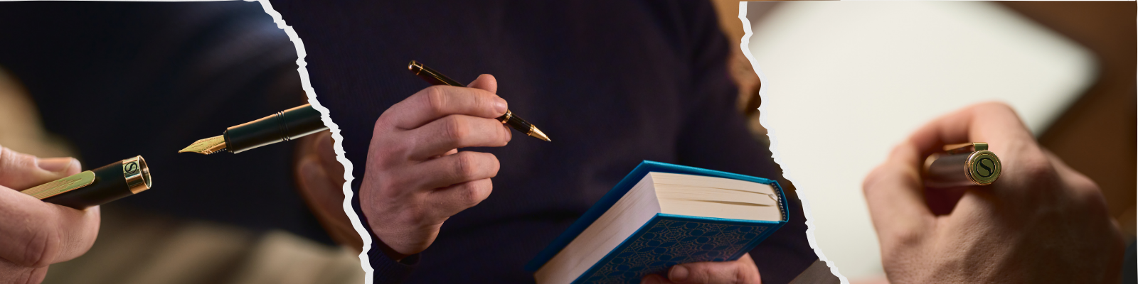
Scriveiner Füllfederhalter sind so konzipiert, dass sie mit jeder Tinte in jeder Farbe funktionieren. Wenn du jahrelang in derselben Farbe geschrieben hast, ohne darüber nachzudenken, könnte ein neuer Tintenfarbton Ideen anregen und eine andere Art von Aufmerksamkeit einladen. Und Aufmerksamkeit, wie du bereits weißt, ist alles wert.

Einen Kommentar hinterlassen
Diese Website ist durch hCaptcha geschützt und es gelten die allgemeinen Geschäftsbedingungen und Datenschutzbestimmungen von hCaptcha.